People asked us to make a template for Google+ profile pages. So we did!
Before we get to the details of that template, it’s worth noting that Google+ still hasn’t gained the kind of traction that everyone assumed a juggernaut like Google could and would achieve. It’s slowly catching on for some, but completely avoided by others. The jury is still out, and Google will undoubtedly keep tinkering with the layout. That means any customization you make could end up needing a bit more customization down the road. But the truth is these things aren’t that hard to update, so there’s really no excuse for not having a profile page that shows off who you really are. Or just showcases your beautiful photos. So let’s get to it.
Download the Pixlr Google+ template.
You’ve got some big image options (maybe too big)
The first thing you need to know about your Google+ profile image is that it can be HUGE. In fact, it’s probably easy to make it too huge. The maximum size is a whopping 2120 x 1192 pixels. I don’t recommend filling all of that space unless you have an image that absolutely deserves to take up that many pixels. Heck, you may not even have many images that will look wonderful at that size, so it may make sense to not take it to the max. I’ve provided you with a half-sized template, but you can always make a new Pixlr Editor image that is the maximum size. The most important thing to know isn’t really the pixel size. Just make sure your image has a 16:9 size ratio. Not sure how to calculate ratios? Try this handy Aspect Ratio Calculator.
Here are a few acceptable sizes based on the 16:9 ratio:
- Maximum: 2120 x 1192
- Half size: 1060 x 596
- Minimum: 480 x 270
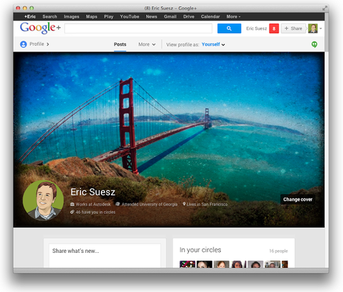
Visitors won’t always see it in all its glory
The second thing you need to know (if you didn’t already) is that only a portion of your image will regularly be seen when people load your profile page. Although viewers of your page can easily pull down the image to see more, they typically won’t see it all. This gives you an obvious opportunity to put something compelling in that small visible strip to encourage people to view the whole thing, but then again Google has added a gradation to the bottom strip where your avatar appears. I personally don’t like this gradation and think it looks kind of gaudy, but there’s no way to remove it (that I’m aware of). You’ll see in my template that I’ve indicated where the avatar strip starts and ends.
It shrinks to fit
Another important detail to consider is that the design is responsive. That is, it will shrink to fit the size of the device it’s viewed on. So will your image. You can see this at work by simply resizing your browser window. Unlike your Facebook timeline photo, the other elements on the page will move around (e.g., “add to circles” button), so don’t bother trying to work around — or work in — those details. Google doesn’t really give you the opportunity like Facebook does to make a clever image with your avatar working in conjunction with other elements of the page. But of course there’s nothing wrong with just displaying a pretty picture. If you’ve got an image that fits this massive space well, grab the Pixlr template and make it so.
My solution: Make an image with effects I love
All of this could affect the type of image you choose. Since you won’t be able to achieve an absolute location, you may be better off with a pretty design, a beautiful landscape, a nice macro shot, or just something that you’ve worked up with effects and overlays and borders that you like. That’s what I did. Since I live in San Francisco, it’s an excuse to take that beautiful Golden Gate Bridge and work it up in Pixlr Express with some of my favorite effects.
Want to create a maximum-sized image but don’t have any images that size? Remember those wallpaper sites where you could download creative designs and photos for your desktop? They’re still around and could be great places to find images to use for your Google+ profile.