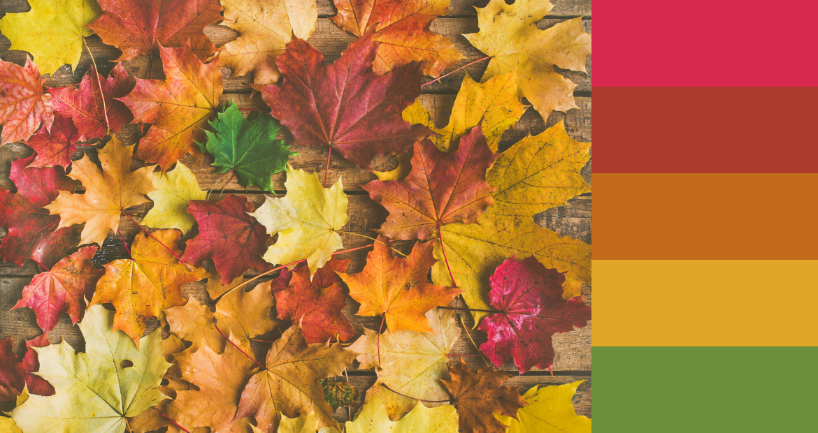
5 Fall Color Palettes & How To Use Them In Your Designs
Fall is an exciting time of the year. It’s a distinct season where the hues ranging from fiery reds to yellow ochres take over landscapes. It’s nature taking the final stage, showing off its last burst of beauty before it retreats into hibernation during winter.
There’s a reason why autumn is the favorite season for many people around the world. Inspiration strikes upon a glance at Mother Nature. Earth’s autumn color palettes are natural mood boards for brands to supercharge their visual communication and design.
The Power of Colors
In the world of branding and design, color is key. Colors spark a variety of emotions, moods and thoughts. It’s a key component to nailing what feelings you want to evoke in a consumer.
A simple explanation would be how food and beverage companies love using blends of red and orange in their marketing. That’s because it stimulates appetite and evokes the taste buds.
Put simply, by utilizing colors in an effective way, you’d be able to tell stories and build emotions by seeping into their subconscious using the power of colors.
Now, if you’re wondering about the colors of this season, keep reading because we’ve specially curated five fall palettes that you can try out this fall!
- Winding Woods
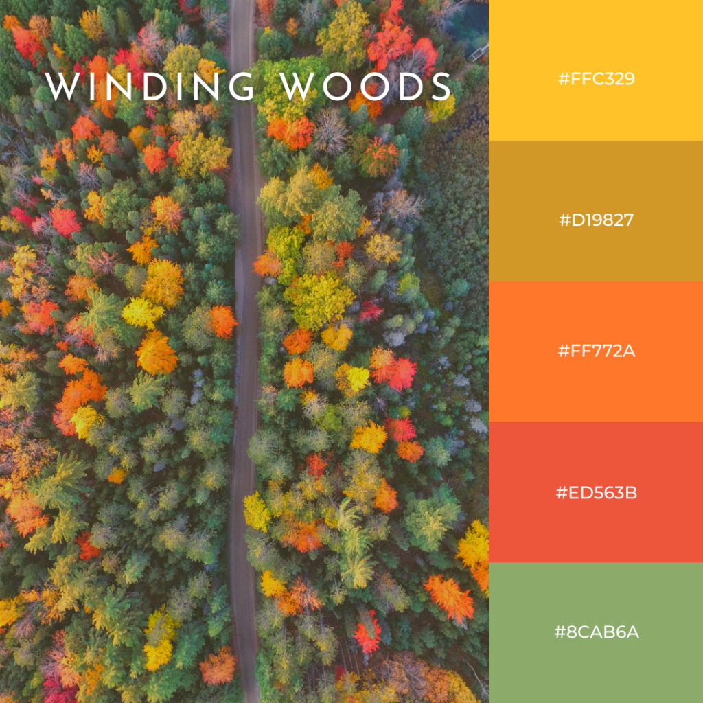
The first thing that comes to mind when it comes to autumn colors are shades of yellows, browns and reds. This is a public service announcement: it doesn’t always have to be the case!
Pop some green into your color scheme to give your product a burst of liveliness and optimism. The sage green here also works well to break up the rest of the ochres and oranges. With the bright colors, it will definitely amplify the message of a youthful brand.
Though it might seem unfitting for an autumn-themed color palette to include a mix of green, your audience might appreciate a break from all the muted browns that will be hogging the internet space for the next month or so. So don’t be shy to step away from the traditional muted colors of fall and mix things up with some vivid colors!
2. Pumpkin Spice
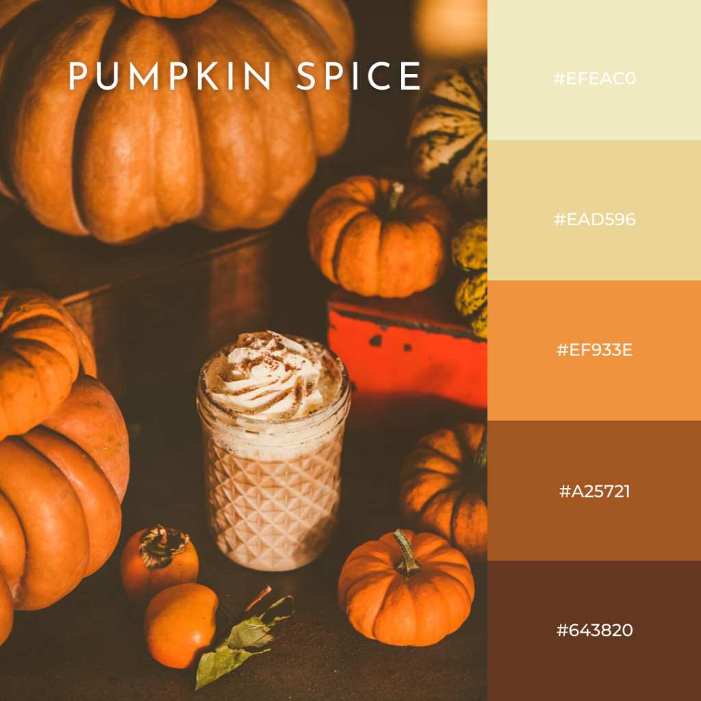
It’s not autumn without this color palette. It’s pure autumn vibes. You can already smell the pumpkin spice in the air when you look at this mix of colors.
The earthy tones here reveal a homely feeling and sense of groundedness. With the combination of the vibrant yet muted pumpkin orange, creams and cinnamon browns, one can definitely feel the warmth through the screen.
This spicy yet comforting color palette can crank up the coziness factor for any product. Brands that market themselves as authentic and honest should try this out! It’s a no-brainer color palette that could work well with almost everything! Picture a bakery selling pumpkin spiced goods with packaging using this color scheme. Shut up and take my money!
3. Fallen in Love
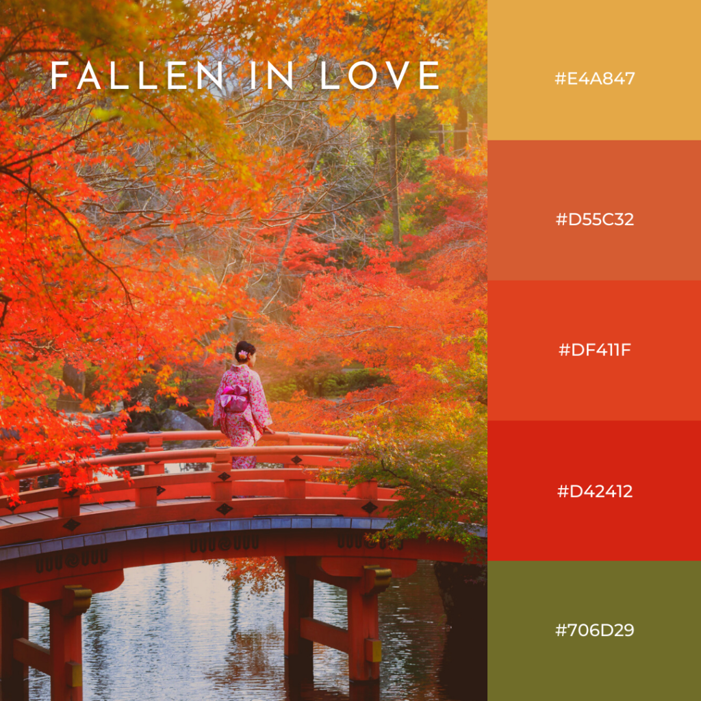
We can’t get enough of the distinct colors of autumn. It makes us want to dance. It’s almost as if nature has saved up its beauty throughout spring and summer and decided to unleash it now.
To us, autumn is the time where the world prepares for the year ahead. And this color palette understood the assignment. It follows the footsteps of life, opportunities and rebirth. Amidst the hues of yellows and reds, the green adds a feeling of hope and confidence.
The bright red also evokes passion and love, making it a good look for upbeat and lively brands that are always looking for the next window of opportunity. If not, this color scheme could also pair really well with a 70’s kinda vibe!
4. Sweater Weather
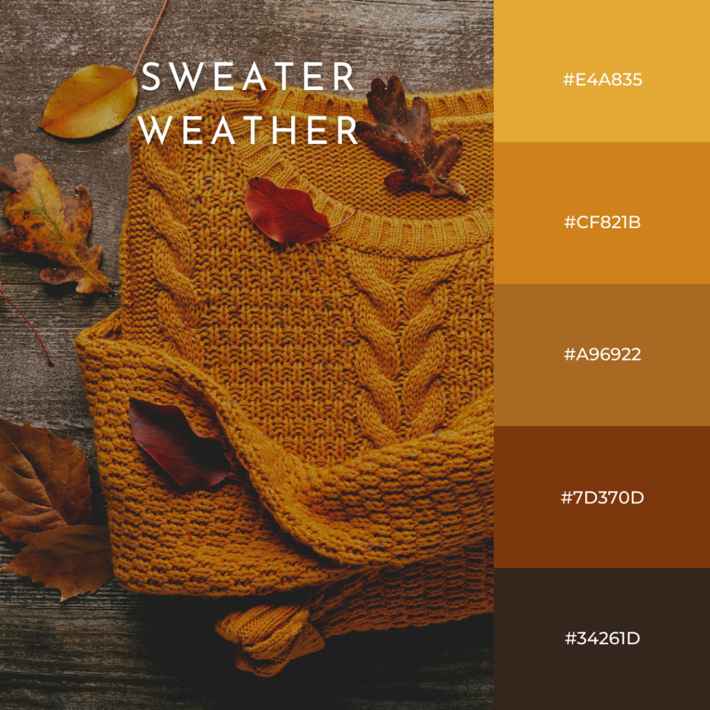
After months of the summer heat, we’ve stepped into the breezy season of autumn. A trip to the misty woods and you’d probably see these similar shades of brown. Get toasty with this sweater weather color palette – the mustards, the caramels and the hickory brown work so well together to create a rich elegant spookiness.
Color psychology says that browns are often associated with strength, reliability, and security. Hence, we can see this color working well with brands that value the importance of mental health, emphasizing taking time for yourself to stay grounded. Not to forget, having a clear headspace (possibly with a sweater that brings you comfort!)
Nevertheless, it’s one of the most iconic fall color combinations. You really can’t go wrong with this.
5. Calming Como
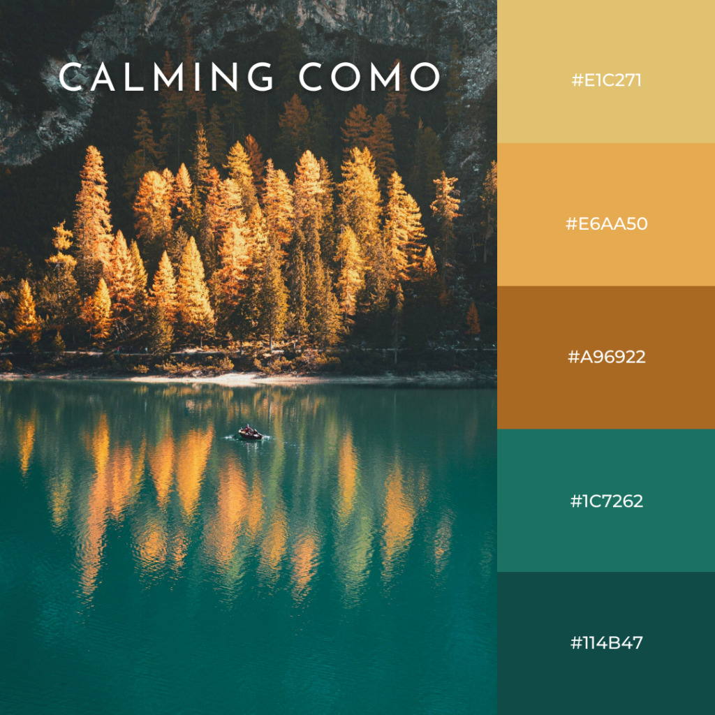
We know by now that not every fall color palette needs the traditional subdued colors of browns and reds. Sometimes, what it needs is a sharp contrast to kick it up a notch, and there’s no better way to do that than to add a tinge of teal.
This color scheme perfectly balances it out from being too warm or monochromatic. Just like the tranquillity one gets from being by the lake, the dark teal of this color palette can add a touch of serenity to any design or product.
The healing effects of teal come from combining the elements of green and blue. Adding this luxurious deep shade would elevate your product and definitely let your brand shine through. Perfect for any product that values a certain sophistication and grandeur.
Don’t Underestimate The Colors Around You
As the saying goes, there’s a reason we don’t see the world in black and white. That’s because colors can have the ability to influence us and create interesting narratives, whether we notice it or not.
Learn to utilize different colors and the meaning and energy of each color. Not only will you have created a product or a brand that holds much more meaning, but you’ll also get to spark the right emotions in your audience.
We hope these autumn-inspired color palettes have inspired you!
