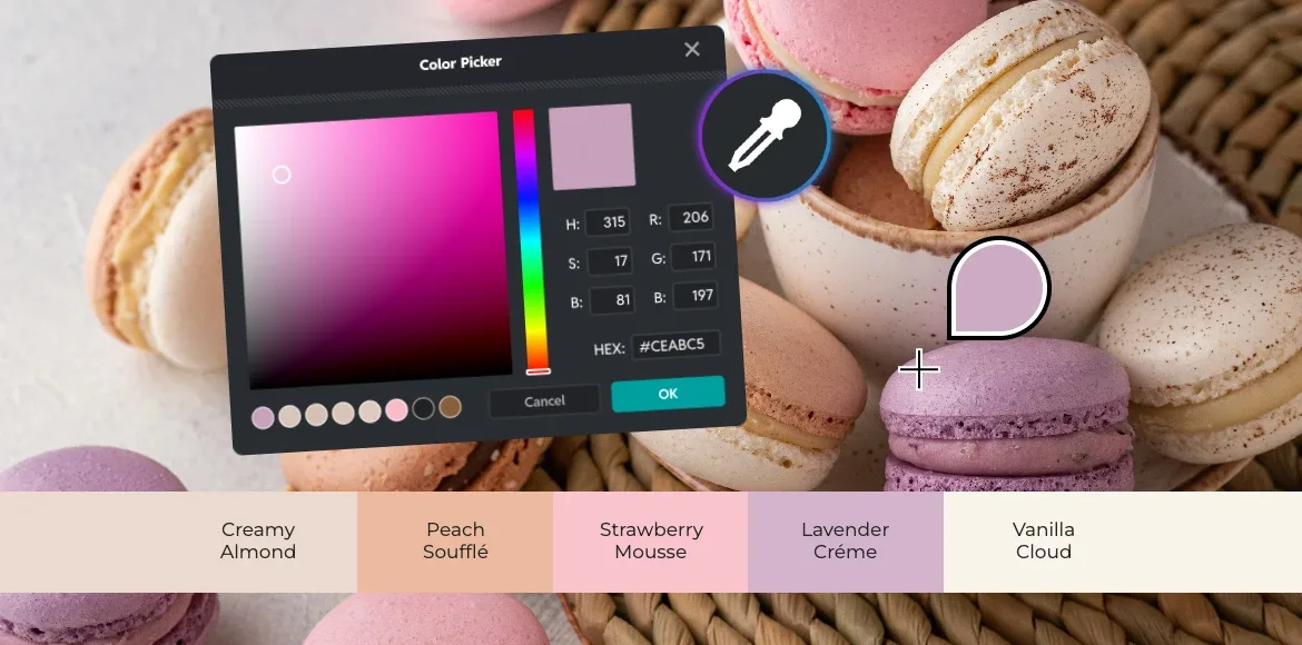
Create On-Trend Designs with Pixlr’s Color Picker
Seasonal color palettes are more than just trends; they’re powerful design tools that connect with audiences on an emotional level. Whether you’re crafting holiday campaigns, refreshing your brand’s seasonal look, or creating festive social media content, understanding and implementing trending color palettes is essential for staying relevant and engaging your audience.
With Pixlr’s color picker, exploring and applying seasonal colors becomes intuitive and precise. You can sample colors directly from photos using the color picker from image feature, refine your selections through the color wheel and HSB controls and maintain perfect brand harmony across all your designs.
Master the Pixlr Color Picker for Precise Colors
The color picker in Pixlr Editor gives you complete control over your design colors. This versatile tool supports RGB for digital screens, HSB for intuitive adjustments, and HEX codes for exact color matching across platforms. You can set colors using the Eyedropper tool, the Color panel, or the Swatches panel.
Two Ways to Choose Colors
Pixlr offers two methods for selecting colors. First, you can create colors manually using the HSB model. Hue determines your base color (red, blue, green, etc.), Saturation controls how intense or muted it appears, and Brightness adjusts from dark to light. By tweaking these three settings, you can create any color you need.
Second, you can sample colors directly from images. The Eyedropper tool lets you click on any part of an uploaded photo to capture that exact color. This feature makes it easy to match colors from reference images or maintain consistency across your designs.
Built-in Color Harmony
After selecting a base color, Pixlr helps you build a complete palette. The Eyedropper tool automatically suggests color combinations that work well together. It shows analogous colors for smooth, unified designs; triadic colors for balanced contrast; tetradic colors for bold, diverse palettes; and similar shades for subtle variations. These suggestions eliminate guesswork and help you create professional color schemes quickly.
Master Your Palette
Whether you’re matching specific brand colors with HEX codes, pulling colors from photography, or exploring new combinations, Pixlr’s color picker streamlines your workflow. You can save your selected colors to the Swatches panel for easy reuse, ensuring consistency throughout your project. The combination of precise controls and smart suggestions makes professional color selection accessible to designers at any skill level.
The Season’s Most-Wanted Color Palettes
Explore five on-trend seasonal color palettes that are defining this year’s design landscape. Simply click the foreground swatch in Pixlr E to paste these HEX values and save them as swatches for instant access to professional color combinations.
Rich Jewel Tone Color Palettes
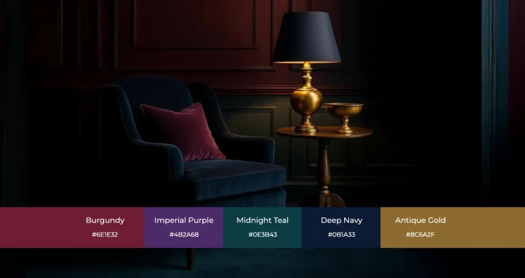
Rich jewel tones, particularly purple and burgundy, are making a bold comeback, adding a touch of drama and luxury to contemporary designs. This palette evokes sophistication, mystery, and editorial elegance that commands attention.
Your Deep & Moody color palette starts with Burgundy (#6E1E32), Imperial Purple (#4B2A68), Midnight Teal (#0E3B43), Deep Navy (#0B1A33), and Antique Gold (#8C6A2F) for warm metallic accents. These colors excel in campaign key visuals, hero banners, and product highlights on dark backgrounds. In Pixlr, sample jewel tones from product shots using the Eyedropper, fine-tune intensity via the Saturation slider, and anchor your designs with muted neutrals for visual balance.
Sophisticated Metallic Color Themes
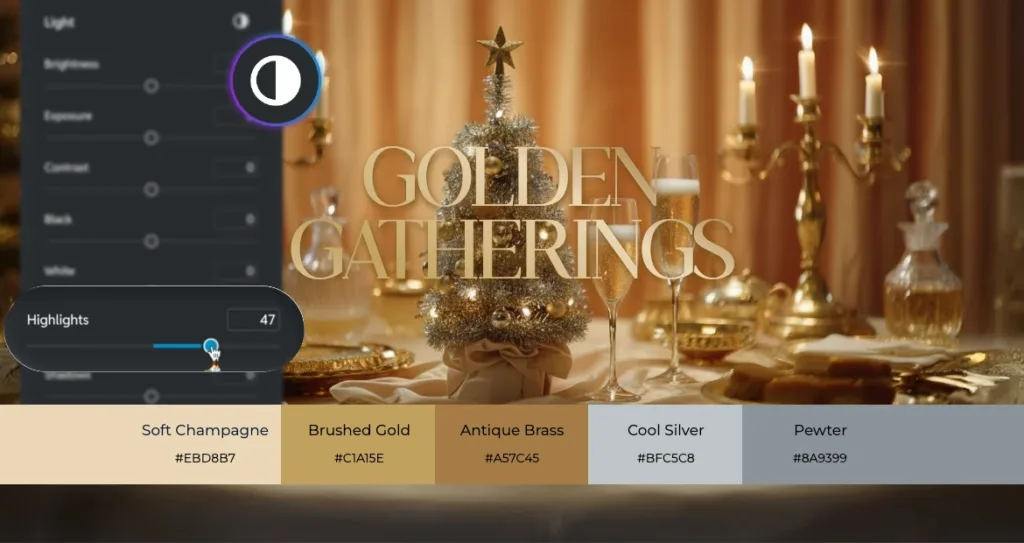
Gold, champagne, and silver continue their popularity, adding sparkle and a classic festive feel that never goes out of style. Build your metallic color palette with Soft Champagne (#EBD8B7), Brushed Gold (#C1A15E), Antique Brass (#A57C45), Cool Silver (#BFC5C8), and Pewter (#8A9399).
These metallic colors shine in headlines, decorative frames, and UI accents where you need elegance. In Pixlr, add subtle gradients and overlays to mimic authentic metallic sheen. Use the Highlights adjustment to create a polished, reflective look that captures light beautifully.
Modern Pastel Color Ideas
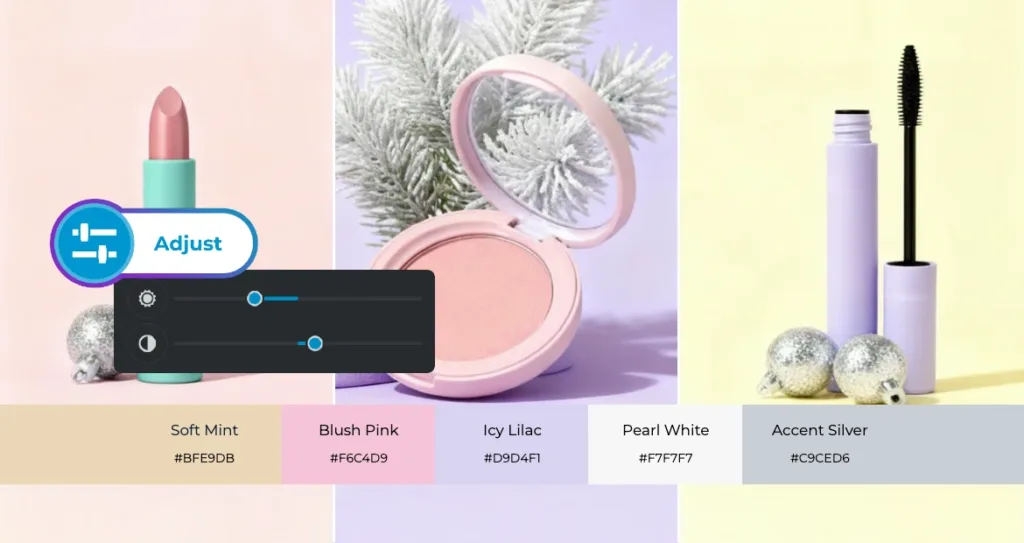
Mint and pink offer a fresh, modern take on holiday decor, often paired with silver and gold for an elegant yet playful aesthetic. Your Modern Pastels seasonal color palette features Soft Mint (#BFE9DB), Blush Pink (#F6C4D9), Icy Lilac (#D9D4F1), Pearl White (#F7F7F7), and Accent Silver (#C9CED6).
These colors excel in lifestyle grids, gift guides, and minimalist product layouts. In Pixlr, pair pastels with metallic line work for definition. Use the HSB controls to slightly desaturate colors for a chic, airy feel that photographs beautifully.
Trending Emerald Green and Blue Palettes
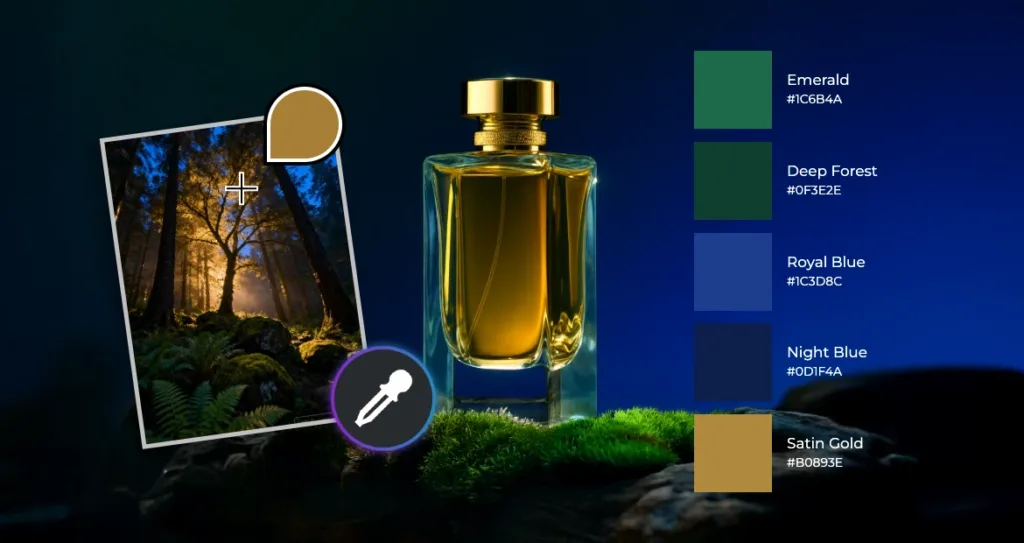
Expect to see deep, verdant greens and shades of blue, especially paired with gold for a regal look. Create your palette with Emerald (#1C6B4A), Deep Forest (#0F3E2E), Royal Blue (#1C3D8C), Night Blue (#0D1F4A), and Satin Gold (#B0893E).
These powerful colors work beautifully in premium packaging mockups and editorial backgrounds. Using Pixlr’s color picker from image feature, sample greenery or sky from photos and unify your design with gold accent swatches for cohesive, nature-inspired elegance.
Nostalgic and Traditional Color Combinations
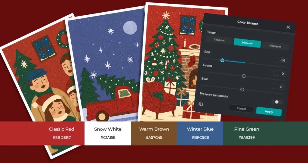
Traditional red and white remain classic, often incorporating brown and blue for added depth. Build your traditional season color palette with Classic Red (#B52A2A), Snow White (#FFFFFF), Warm Brown (#7A4F2A), Winter Blue (#3A5E8C), and Pine Green (#2A4D3E).
These nostalgic colors shine in holiday promotions and email headers. In Pixlr, use selective color techniques to deepen reds without shifting whites, maintaining strong contrast for optimal legibility.
How to Build a Seasonal Color Palette in Pixlr Using the Color Picker
Creating a seasonal color palette in Pixlr Editor is simple, intuitive, and precise. Follow this streamlined workflow to build a palette that strengthens your design style.
Step 1: Open Your Canvas
Go to Pixlr Editor and upload a reference image or mood board that reflects the season or aesthetic you want.
Step 2: Pick Your Base Colors
Use the Eyedropper tool to pick colors directly from your image. Select a handful of key tones, including main colors, accents, and neutrals.
Step 3: Refine Your Shades
Click the foreground swatch to open the Color panel. Adjust your selected tones using the color wheel or the HSB sliders to control saturation, temperature, and brightness. Copy the HEX codes if you need to use the colors across multiple designs or platforms.
Step 4: Keep Your Palette Accessible
Every color you use appears under the Recent Colors section in the color picker. Continue designing with your chosen colors so they stay visible and easy to reuse throughout your project.
Step 5: Apply Your Palette Across the Design
Use your selected tones on text, shapes, backgrounds, and overlays to maintain a consistent look. Export your final design with your chosen HEX codes for accurate color matching anywhere you use your palet.
Expert Tips for Accurate Colors and Better Visual Accessibility
Tip 1: Maintain Contrast for Readability
Always ensure readable text over photographic backgrounds by testing your color palettes in different contexts. Light text on dark backgrounds should maintain adequate contrast ratios for accessibility.
Tip 2: Create Tints and Shades
Duplicate a swatch and adjust Brightness to create a family of related colors for UI states, hover effects, and visual hierarchy. Create at least three variations of each primary color: a tint (lighter), the base color, and a shade (darker).
Tip 3: Document Your Colors
Keep HEX values handy in your brand guidelines and project documentation. Create a master color document that includes HEX, RGB, and HSB values as your single source of truth.
Tip 4: Balance Bold with Neutral
Pair bold seasonal colors with calming grays and creams to create visual hierarchy. The 60-30-10 rule works beautifully: 60% dominant color (often neutral), 30% secondary color, and 10% accent color.
Tip 5: Sample from Hero Images
Use the color picker from image feature to extract colors from your hero photography, guaranteeing visual harmony across all layout elements.

Creative Design Ideas You Can Build in Pixlr
Social Media Design Ideas
Create Instagram stories using Deep & Moody jewel tones with metallic gold text overlays. Use the color picker to sample jewel tones from product photography, then amplify saturation for digital impact.
E-Commerce Banner Ideas
Design e-commerce banners featuring Emerald & Blue backgrounds with gold accents. Use Pixlr’s selective color tools to ensure product colors remain accurate while the background provides dramatic contrast.
Email Banner Design Tips
Craft newsletter headers using Modern Pastels with silver line work for minimal elegance. Apply subtle gradients within your pastel palette to add dimension without losing the airy feel.
Editorial and Lookbook Ideas
Design digital magazines featuring Nostalgic palettes with traditional reds and warm browns. Use the color wheel to find complementary accent colors that enhance your narrative
Seasonal Campaign Design Ideas
Develop comprehensive materials where your seasonal color palette unifies everything from web banners to social posts. Create templates with saved color swatches that team members can easily customize while maintaining brand consistency.
The blend of seasonal trends and precise color control opens up endless possibilities for impactful design. With Pixlr Editor’s intuitive color picker, full color wheel, and image-based color sampling, you have everything you need to build professional palettes that speak to your audience.
Whether you prefer deep jewel tones, elegant metallics, soft modern pastels, rich emerald and blue, or warm nostalgic shades, your ideal seasonal palette is ready to be created. The secret is not just choosing the right colors, but using Pixlr’s tools to refine and apply them with intention.
Great design is more than following trends. It is about shaping them through your own creative perspective. Use these seasonal palettes as inspiration, then adapt them to fit your style and message.
Start bringing your seasonal palette to life. Open Pixlr Editor, sample colors from your images, refine them with the Color Picker, and use your recent colors for a cohesive, on-brand look. The power to create stunning, seasonally relevant designs is in your hands. All it takes is one click to begin.
