Customize Your Twitter Profile Page with This Downloadable Pixlr Editor Template

The social network profile page wars rage on. A good while back, Facebook upped the ante by putting a pretty good-sized header up on top of your profile page. Then Google+ countered with a way for you to put a way-too-ginormous image as your profile header. Bringing up the rear (rolled out in the past week or so and available now for everyone) is Twitter. If you haven’t already been prompted to switch to the new design, you can do that by heading here.
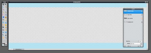
You can add a larger 400×400 pixel profile photo of yourself if you want, and we recommend that you do. The old version was 256×256. Once you’ve done that, you’ll want to focus on the header itself. The size of the header should be 1500×500 pixels. To get you started and see if your favorite image(s) fit, we’ve made a simple Pixlr Editor template that is the right size. You can Twitter Profile Template.

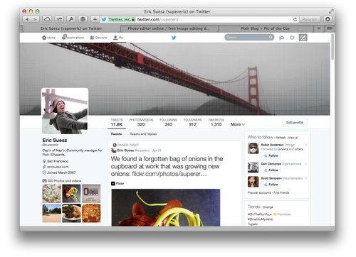
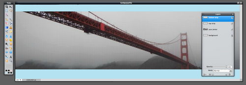
If you care about good design and can spend a little time optimizing it, you can really make your Twitter page look sweet. But you’ll need to make sure you choose images that are large enough to look good in that 1500×500 pixel space. If you absolutely don’t have an image that is large enough (although I’m certain if you dig deep enough you’ll find a photo or could easily take a great one that will work), you can always opt instead for a stylized image. This is a great way to add some art to your profile if you aren’t a high res photo kind of person. For example, I used a photo of the Golden Gate Bridge that I took while out on a shark hunt and added some cool halftone effects and other filters using Pixlr Editor. There are a zillion photos of the Golden Gate Bridge out there in the world — but only one that looks just like this.

This template is a .pxd file, which is the native file format of Pixlr Editor. It has layers, and the layers will be preserved if you save it as a .pxd file. (In fact, you may want to save a copy of this .pxd file to your computer or Pixlr Library so you can edit it again later when you want to update your Twitter profile again). When you’re done making your Twitter image, you can flatten the layers or just save it as a format that Twitter accepts and the layers will flatten automatically: JPG or PNG should both work fine.

You’ll notice that in this template I’ve added a layer for the top strip and the bottom strip below your image. Those areas represent areas of your photo that will be covered up by elements of the Twitter interface on the web. You can hide or remove these layers in the template or just place them behind your image when you’re finished toying with your design.
One other thing… Keep in mind that the user profile photo will bump up into that space. I didn’t include it in this template because where it shows up will change depending on the window size and/or device that it’s seen on. There’s probably no way to solve for every view of this header, but if you are a stickler for positioning, this is something to keep in mind. If you are intent on making sure certain details of your image are not ever covered up by the user profile photo, you will need to place those closer to the right side of your image.
More downloadable templates for social media profile pages
Want to knock out all of the major social network headers at once? Check out our other tutorials and templates for Google+ profile pages and Facebook Timeline images.