How to Create Minimalist Posters for Summer 2021
Whether you have noticed it or not, minimalism is the current dominating trend within the design world. What is it exactly and what has made minimalism become so popular?
Minimalism, at its core, is designing in the most basic form. Unnecessary texture, colors or pattern is usually excluded to give the design a sleek and modern look. As such, it is no surprise that minimalistic posters often ooze class and confidence, standing out apart from its peers that are designed in the more conventional ways.
Now that the summertime is upon us, you may be wondering on how exactly you can incorporate minimalist principles and techniques to your designs. In this article, let us guide you on how to do so and guarantee that your next summer poster would simply have the best minimalistic arrangement!
1. Stick to The Scheme
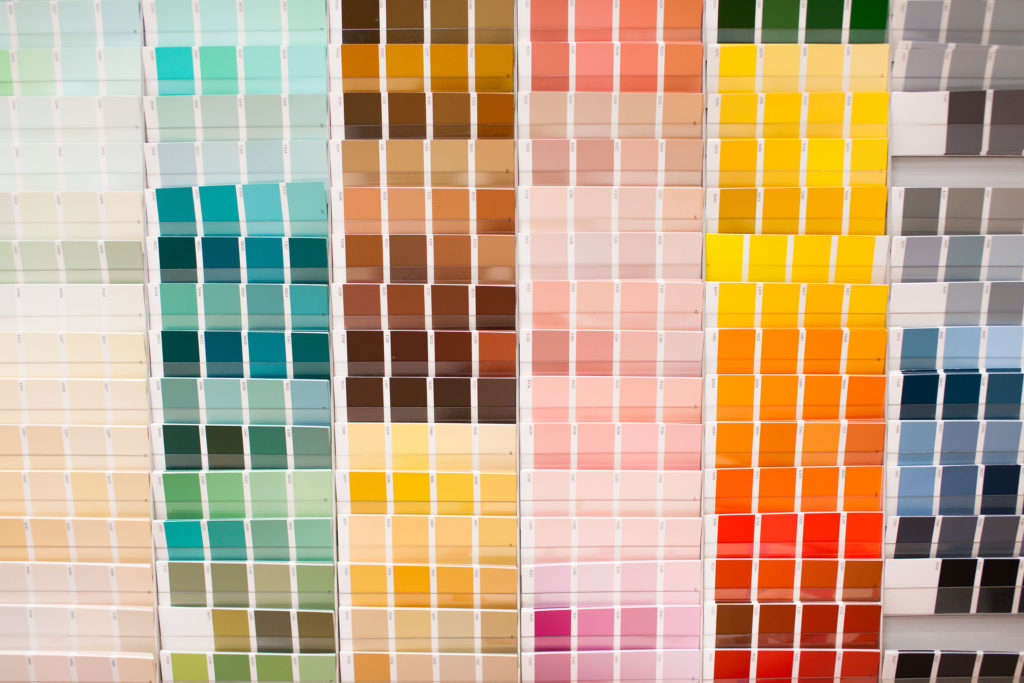
One common misconception regarding minimalist posters would be how many people think that it should solely centered around calm or muted colors. That is however, simply not true. You are free to utilize vibrant colors as long as you do so with intention and follow a certain color scheme. This is especially important to convey summer vibes as one often associates summer with hot or warm colors.
To approach this with solely monochromatic palettes of orange or yellow would be a good idea. Combining it with texts in blue would also be advisable; as blue is the complementary color of orange. In getting a clear idea on which color schemes you can pick out for your minimalistic summer poster, see below:
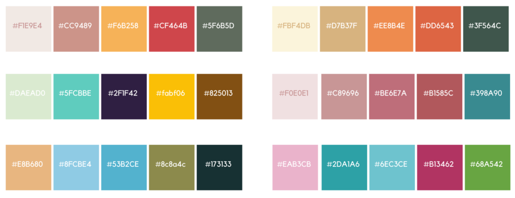
However, please keep in mind that the tones you have selected should create a sense of balance in your posters. For instance, there should still be some muted colors paired with warm ones in creating a nice contrast. This is so you can accentuate the design elements that really matter in your posters.
2. Use Powerful Imagery
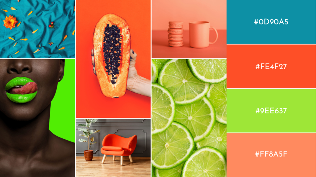
In depicting summery vibes into your minimalist poster, be sure to insert the right image as the central focus. Though you are encouraged to try different composition techniques to produce a pleasing dynamic, putting the main visual right at the center of your poster can also be opted.
This imagery can be in the form of realistic photographs or simple illustrations. Remember to be creative and find unique angles of summer to prevent your poster from being seen as cliché or overused.
One great tip for minimalistic poster design is to pick a visual that is cropped in an interesting way, hence giving out a sense of vagueness to the viewers. Though the overall look is abstract, said visual needs to be able to communicate the right message to its viewers too; this can be aided by using the right color selections and the best copy placement.
3. Create Simple Illustrations
As one would expect, a simple illustration is often the focal point of a minimalist poster. A known trick in creating a minimalist illustration for your poster would be to reduce unnecessary details of said object or view, hence reducing them to their basic geometric shapes.
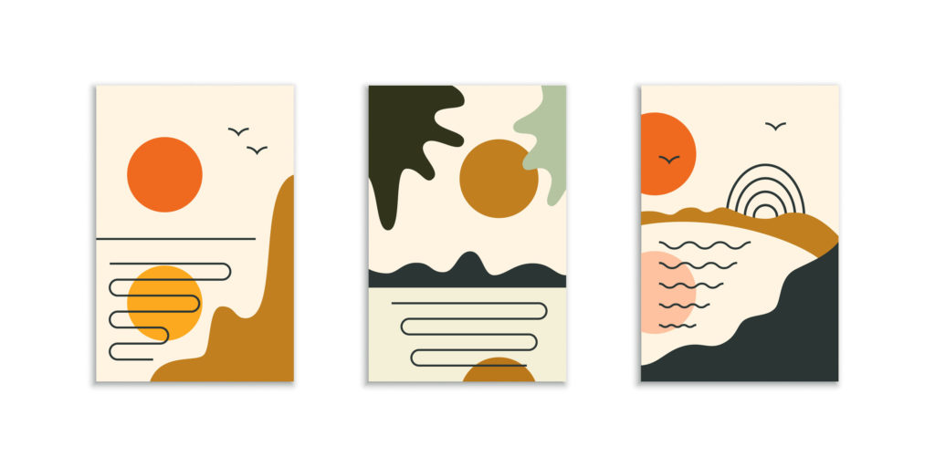
Be sure to break down images that are often associated with summer. For instance, with only a couple of circles and some curved shapes, you can illustrate a warm sunset by the beach as pictured below:

You are also encouraged to create a sequence of summer posters in which you can showcase how diverse you are in designing minimalist illustrations. This would be a fun opportunity for you to experiment with different compositions, making your minimalist posters all the more interesting.
4. Typography Matters

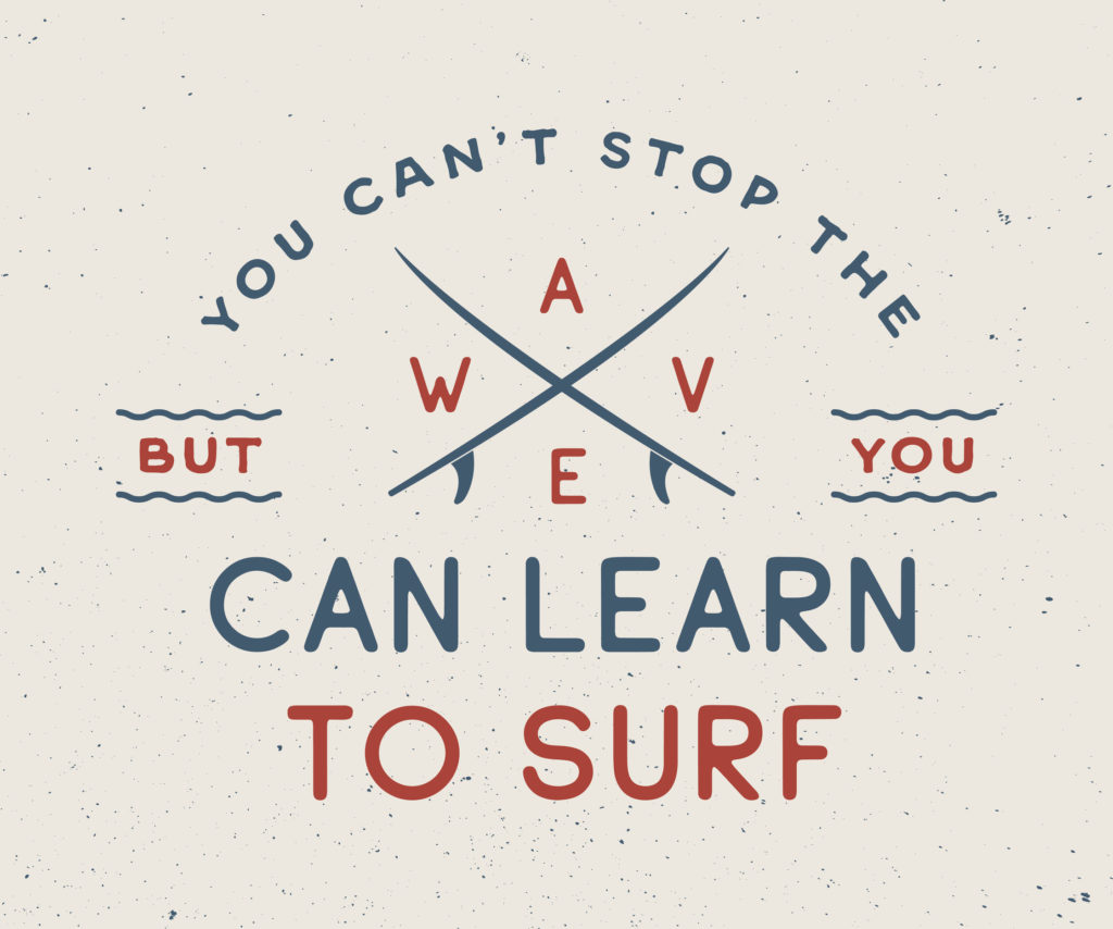
Utilizing fonts to ensure that your message can be conveyed within the least amount of graphic elements is also a clever trick. This is as typefaces are extremely diverse; they are powerful tools that give you maximum creative freedom. You are free to arrange them in ways that are thought-provoking.
If you decide to go fully type-centric and design around your copy, that would also be a great technique to create an eye-catching summer poster. Even bolder, you can have the copy occupy the entirety of the poster; preferably one that is a catchy phrase related to summertime. Though this approach is overwhelmingly simple and straightforward, it is guaranteed that your audience would be able to decipher your message instantaneously. Come up with a catchy slogan that is filled to the brim with summer vibes and don’t be afraid to get punny!
5. Combine Your Elements
Last but not least, you can experiment with layering and combine your design elements to improve your poster’s composition. Go wild and let your imagination roam free. By integrating design elements such as fonts and images, or fonts and colors together, you are delving into endless possibilities of unique layouts. What’s more, you can utilize the layering feature on Pixlr for free and experiment to your heart’s content.
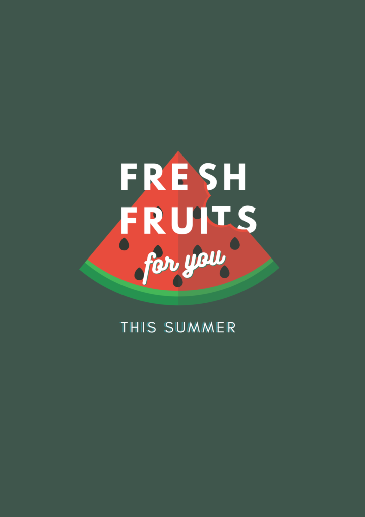
As you can see, minimalist design promotes the very phrase “Less is more.” With this approach, there is no need to utilize exaggerated design elements to catch the attention of your target market.
In Conclusion…
Within the advertising world that is already filled with so much white noise, minimalism can draw your audience in with its raw simplicity. It is guaranteed that your minimalist summer poster would be able to give them a much needed break from overly complicated designs, hence reeling said audience into your product instead.


