
Color is more than a visual decision. It is emotion translated into design, a bridge between memory and meaning, and a core ingredient that shapes how people respond to what they see on screen. In today’s digital world, color defines brand personality, strengthens storytelling, and enhances the way audiences interact with content. Designers and creators know that a single shade can shift an entire user experience, and that the right tone can make a visual feel warm, bold, calm, modern, or nostalgic. This is why the process of choosing color matters as much as the design itself.
Pixlr’s color picker gives creators an intuitive and powerful way to find the exact color they need. Whether you prefer crafting a color manually or capturing inspiration directly from an image, Pixlr helps you build palettes with purpose and clarity. Instead of guessing or relying on presets, you gain the confidence to design with colors that not only look beautiful but also feel meaningful.
Why Color Matters in Digital Design
Digital design lives on fast-moving platforms where visuals compete for attention every second. Color has become one of the quickest ways to grab attention, guide the viewer’s eye, and communicate a message without using words. It can highlight key elements, set emotional tone, or strengthen the identity of a brand.
A deep blue can build trust. A warm beige can create a handmade, personal feel. A vibrant coral can energize a social media graphic. Color influences perception immediately, which makes careful color selection essential for designers. Pixlr supports this process by giving you precise controls, intuitive tools, and smart harmony suggestions that make color choice both strategic and creative.
How Pixlr’s Color Picker Helps You Find the Right Color
Pixlr offers two main methods for selecting colors. These tools allow you to create custom tones or extract accurate colors from real images, depending on your needs.
1. Create Custom Colors Using HSB and HEX Controls
Double-click the color box in the toolbar to open the Color Picker. This tool lets you create colors from scratch. If you already have a brand HEX code, enter it for perfect consistency. If not, start by choosing a shade from the hue bar, then refine it using the HSB sliders.
- Hue sets the base color, such as blue, red, green, or yellow.
- Saturation controls how bold, soft, vibrant, or muted the color feels.
- Brightness adjusts the tone’s lightness or darkness.
With these controls, you can create precise colors for your brand, UI design, illustrations, and custom color palettes. Pixlr’s color picker makes it easy to achieve exactly the tone you need using HSB, HEX, and the full color wheel.
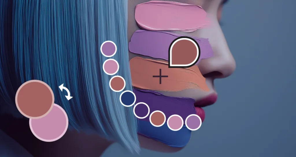
2. Pick Exact Colors From Images With the Eyedropper Tool
Sometimes the perfect color already exists inside your photo, artwork, or reference material. Pixlr’s Eyedropper tool lets you click on any area of an image to select and capture that exact tone instantly.
This helps you:
- Matching brand colors from logos
- Pulling palettes from portraits
- Extracting natural tones from landscapes or objects
- Keeping color consistent across multiple designs
- Building authentic, memory-driven palettes
Sampling colors from images makes your work feel personal, grounded, and artistically cohesive.
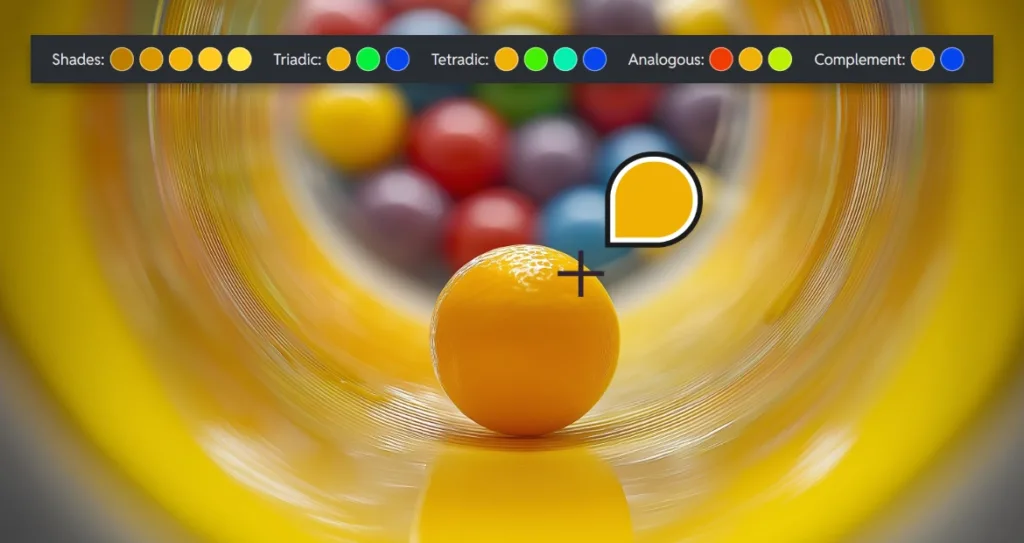
Build Beautiful Color Palettes With Pixlr’s Harmony
Tools
Choosing one color is only the beginning. Building an entire palette that feels professional and balanced is the real challenge. Pixlr simplifies this with built-in color harmony suggestions that appear automatically after you select a base shade. The tool presents several harmonious combinations that designers often use to guide layout, contrast, and atmosphere.
Pixlr suggests analogous colors for smooth tone transitions, triadic combinations for balanced contrast, and tetradic colors for bold and diverse palettes. You will also see similar shades that help create depth or subtle variation. These recommendations remove the uncertainty from palette building and give you a strong starting point for high-quality visual design.
Color harmony tools help beginners find confidence and help professionals move faster without compromising on style or strategy. With Pixlr, creating custom palettes becomes an enjoyable part of your workflow rather than a frustrating trial of guess and check.
How to Manage Brand Colors in Pixlr for Consistent Design
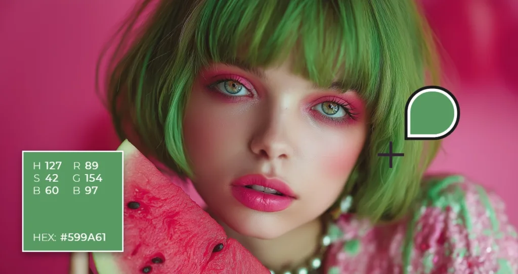
Maintaining consistent brand colors is essential for building recognition and trust, and Pixlr gives you several reliable ways to keep your palette accurate across every project. The most effective method is to use your brand’s HEX codes, which ensures your colors stay uniform wherever they appear. Enter your HEX values whenever you begin a new design, and Pixlr will display the corresponding RGB and HSB values so you can fine-tune each shade with precision.
Another helpful approach is to duplicate your PXZ project file, especially when you are creating a series of visuals for the same brand. Duplicating the file preserves your “Recent Colors,” making it easy to continue designing with the same tones without needing to reselect or reenter them. This workflow helps you maintain a consistent palette across social graphics, product images, ads, UI layouts, and other long-term design projects.
By combining accurate HEX input with the flexibility of project duplication, Pixlr offers a smooth and dependable way to manage brand colors. You can quickly copy, reuse, adjust, and compare tones as needed, helping you maintain a cohesive visual identity while keeping your creative process efficient and stress-free.
How Color Theory Improves Your Digital Designs With Pixlr
Color theory influences the way people perceive your work, which makes it one of the most important foundations in modern digital design. Whether you are creating social content, brand systems, UI layouts, or illustrations, your understanding of color harmony, contrast, and mood affects how your audience reacts to your visuals. Designers use color theory to build balance, guide attention, and create emotional resonance in a world where every pixel can shape a first impression.
Pixlr supports this process by giving you tools that make color theory easier to understand and apply. When you select a base color, Pixlr automatically suggests harmonious combinations that follow established color theory principles. Analogous palettes help you create soft, unified visuals that work well in lifestyle and editorial content. Triadic palettes produce balanced contrast that stands out on social feeds, while tetradic combinations give you bold, dynamic variety for brand campaigns or advertising visuals. With Pixlr, color theory becomes a practical part of your workflow rather than something you need to calculate manually. These tools help you build palettes that feel polished, intentional, and visually consistent across every creative project.
Choosing Between RGB, CMYK, and HEX Codes
When Designing Online
Different projects require different color formats, and understanding when to use RGB, CMYK, or HEX codes is essential for designers working across digital and print platforms. RGB and HEX formats are designed for screens, while CMYK is used for printed materials. Knowing the difference helps you maintain accurate colors and produce professional results across every medium.
RGB is built from red, green, and blue light, which makes it ideal for websites, social media graphics, digital ads, UI design, and anything viewed on a screen. HEX codes are a simplified version of RGB, often used for web design, branding guidelines, and digital marketing assets. CMYK is created from cyan, magenta, yellow, and black ink, which makes it the standard for brochures, posters, packaging, and any design that will be physically printed.
Pixlr allows you to work confidently with these formats by giving you clear values for every color you select. When you use the color picker, you can view the RGB values, copy the HEX code for brand consistency, and adjust tones using HSB sliders for creative control. This makes it easier for designers to stay accurate, collaborate with clients or printers, and prepare visuals that look correct across both digital and print environments. By understanding how these formats differ and when to use each one, you ensure your projects always display the colors you intended.
Why Pixlr’s Color Picker Is Essential for Modern Digital Designers
Today’s creators need speed, consistency, and creative freedom. Pixlr’s color picker provides all three by combining manual control, image-based sampling, and intelligent harmony tools. Designers can explore colors based on inspiration, brand identity, real images, or artistic experimentation while staying accurate and intentional. When your colors carry meaning, your design gains impact. Pixlr gives you the tools to discover the right colors and apply them with confidence.

