Pixlr Editor Design Refresh

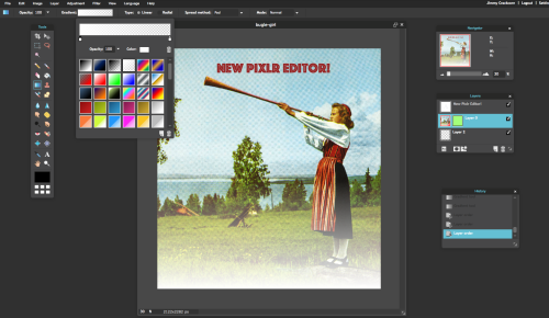
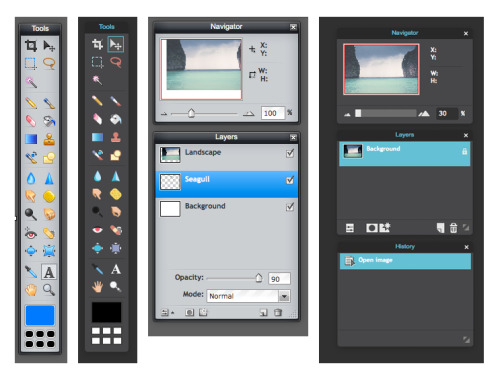
Big update today! Pixlr Editor, our long-standing graphic design app, just got an extreme makeover. If you’ve ever used the app before, you’re going to go “whoa” the next time you open it up. As you can see, the look and feel of the app is now completely different. It’s a more sophisticated look, no doubt about it. The new black background is sleek. Looks quite different when you compare it to the old version:

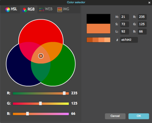
Obviously, it looks very different. More modern. The Pixlr Editor app has been around for many years with the same look. What really will stand out to you are the toolbar icons, the menus, the color selector, the brush selector, etc. It’s all been redone with a more friendly look.

What’s next for Pixlr Editor?
We have a lot of requests from users of this app that have built up over time, but we’re always open to hearing more. We would love to hear what you think about the new Pixlr Editor refresh and collect your thoughts on what might make it an even better app in the future. You can give us a shout on Twitter @pixlr or send us an email at an email address that we set up just for the purpose of hearing your feedback.