Top Spring Design Trends to Incorporate into Your Visual Branding
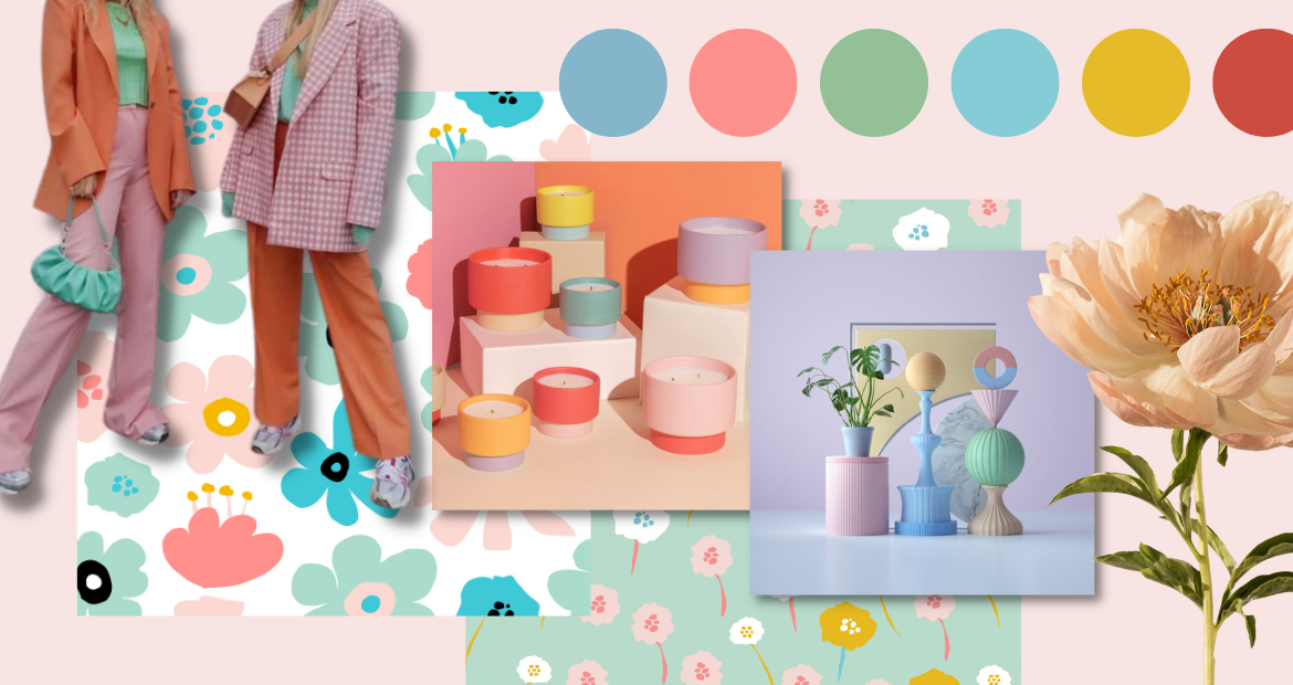
Playful pastels, ice-cream shades, unruly floral patterns, funky organic shapes, and vibrant colorful textiles – these are some of the most iconic spring trends we’ve spotted across the world of fashion, interior and graphic design.
Here at Pixlr, we love to push the boundaries of design and experiment with new trends to create something memorable and lovable.
This spring, we want to incorporate these trendy patterns and cheery colors into our designs – let us show you how!
Utilizing Geometric Shapes
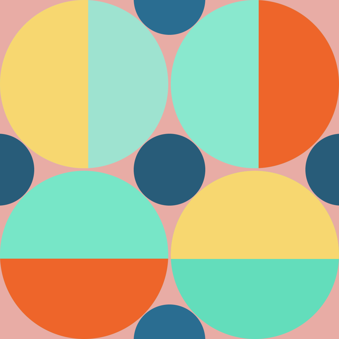
Here, we want to show you how to combine different geometric shapes in order to create a modern and playful pattern fitting for spring.
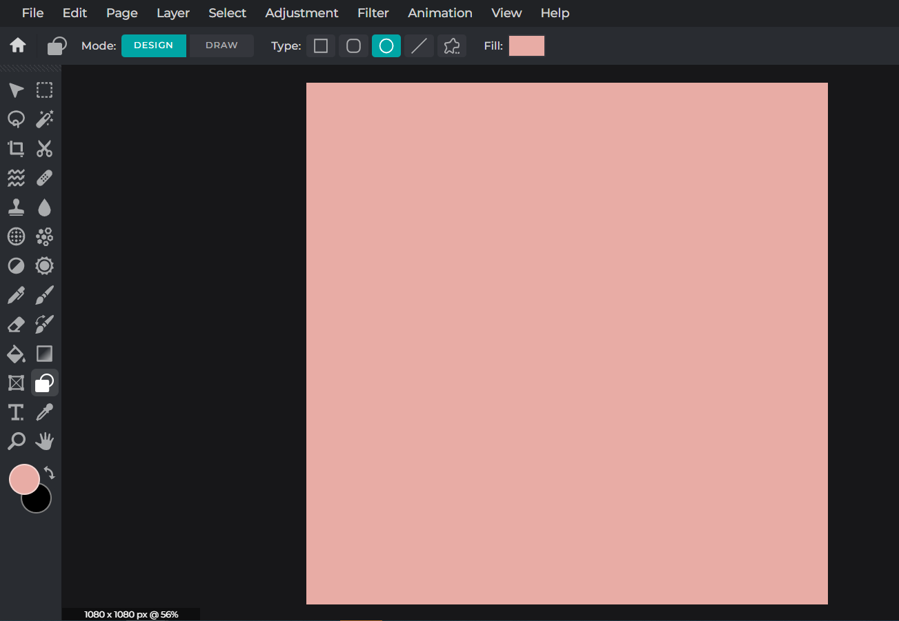
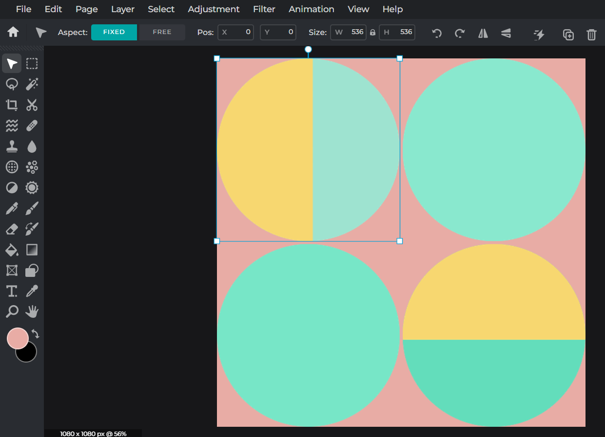
Start with a plain background with a color of your choice. Here, we’re going for a pretty blush pink.
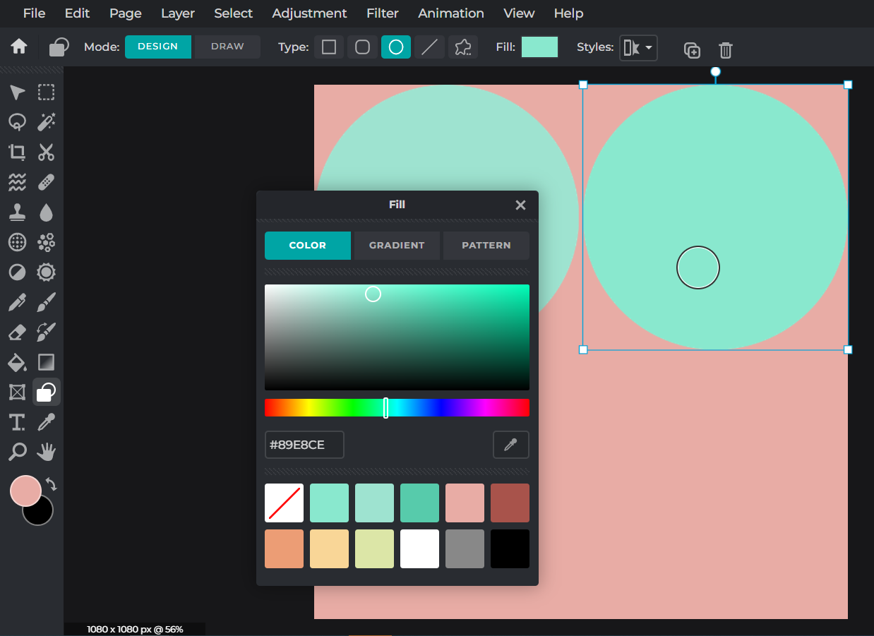
Now, we’re going to use the Shape tool to create some circles but in a different color that stands out from the background. We’ve chosen some pale turquoise shades for our circles.
We’re making some bright yellow semi-circles and placing them above the existing turquoise circles.
Here’s how to do it. First, you generate one full yellow circle, then rasterize it into an image layer, use the Shape mask from the Cutout/Mask tool to cut it into a semi-circle, and finally duplicate the semi-circle to create multiple copies.
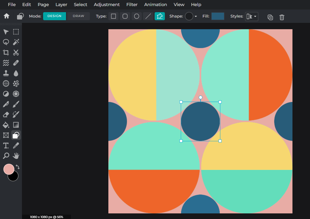
Now that you know these basic techniques, you can go as wild as you want and create as many shapes as you please.
It’s also important to take note of the colors you choose for your shapes. Here, we’re going for a dark blue as it balances out the rest of the color palette.
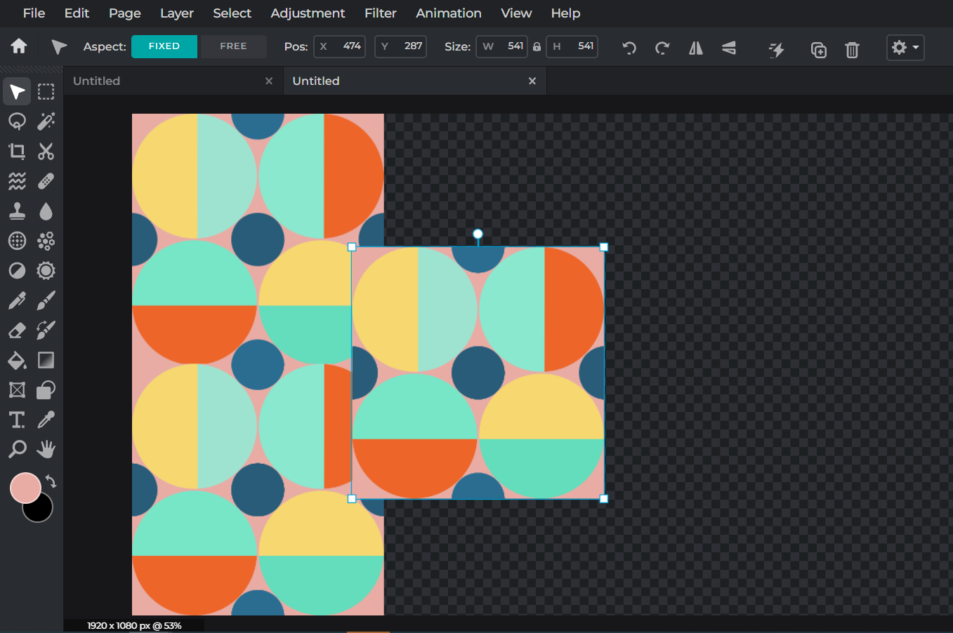
Once you have your finalized artwork, you can freely use it to create a seamless pattern.
Utilizing Contrasting Colors
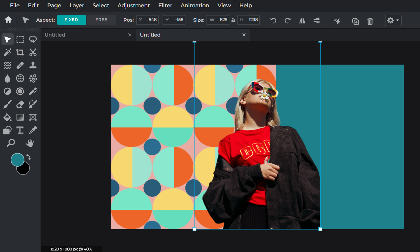
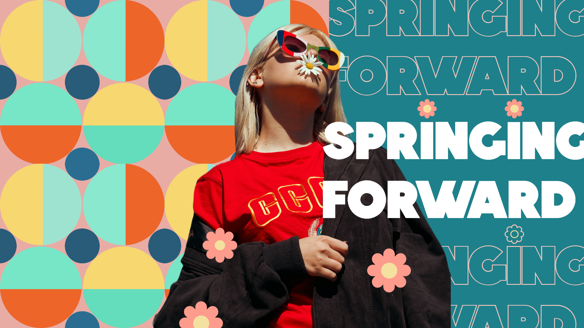
Using the AI Cutout tool, we’ve added a portrait to our design, an image with colors that really pop. We’ve also made the background a deeper shade of teal to create a beautiful contrast with the red shirt our model is wearing.
Incorporating Simple But Bold Fonts
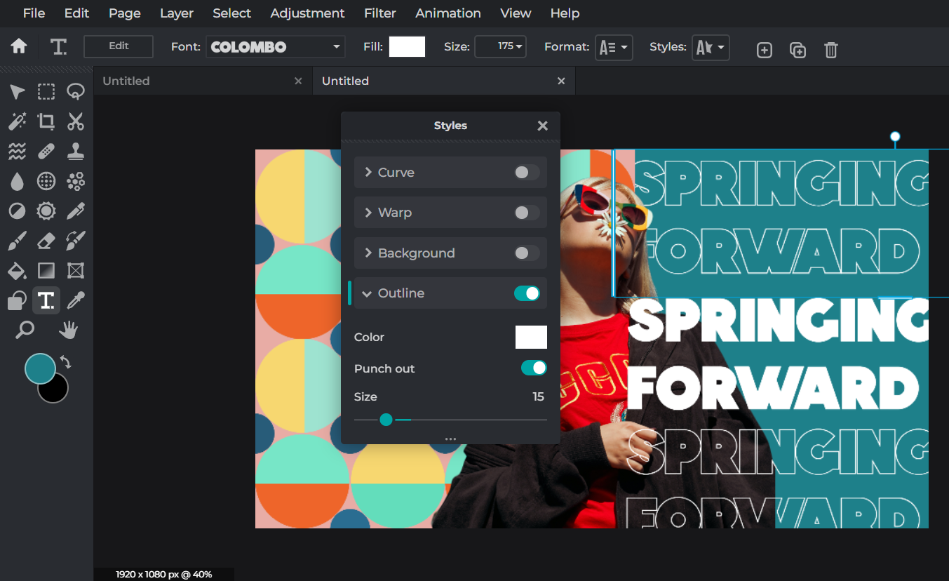
Here, we’ve decided to go with Colombo as our font because we want to incorporate a simple, modern sans serif typeface that doesn’t overcomplicate or overwhelm the design but simultaneously demands for attention.
Incorporating Floral Elements
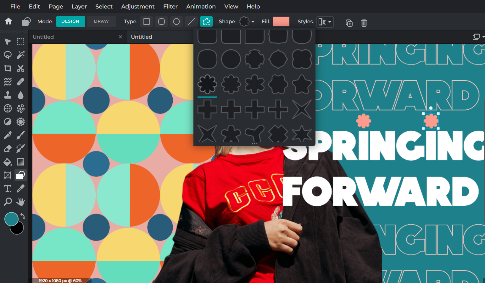
Once again, we’re using our versatile Shape tool to create these adorable tiny flowers to go with our main text.
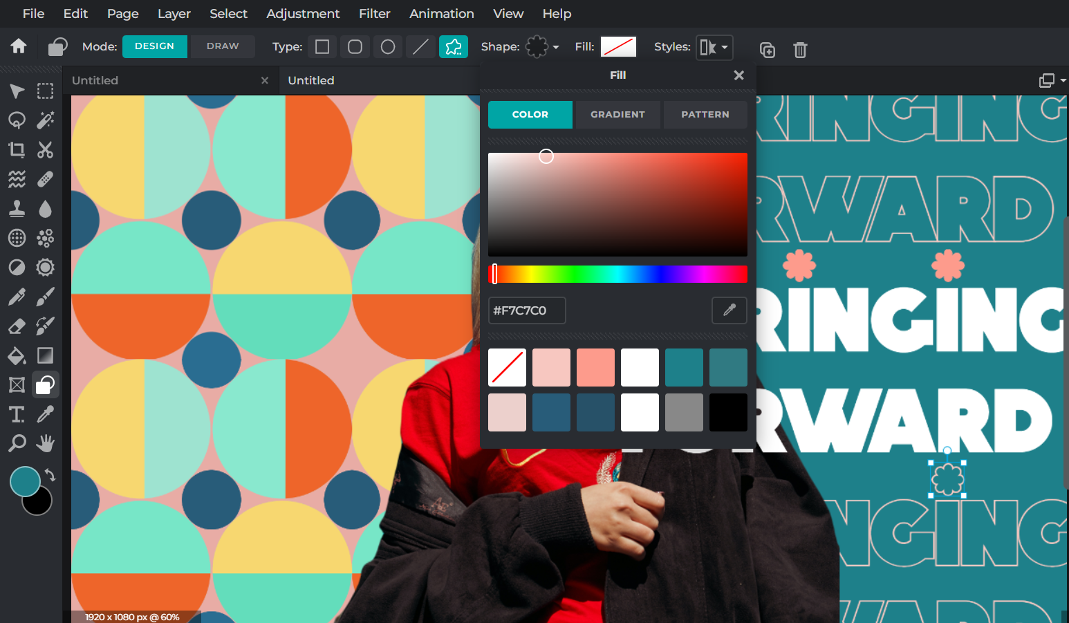
To create a hollowed flower that matches our punched-out text at the bottom, simply select Outline in Styles, and then go back to Fill and click on None.
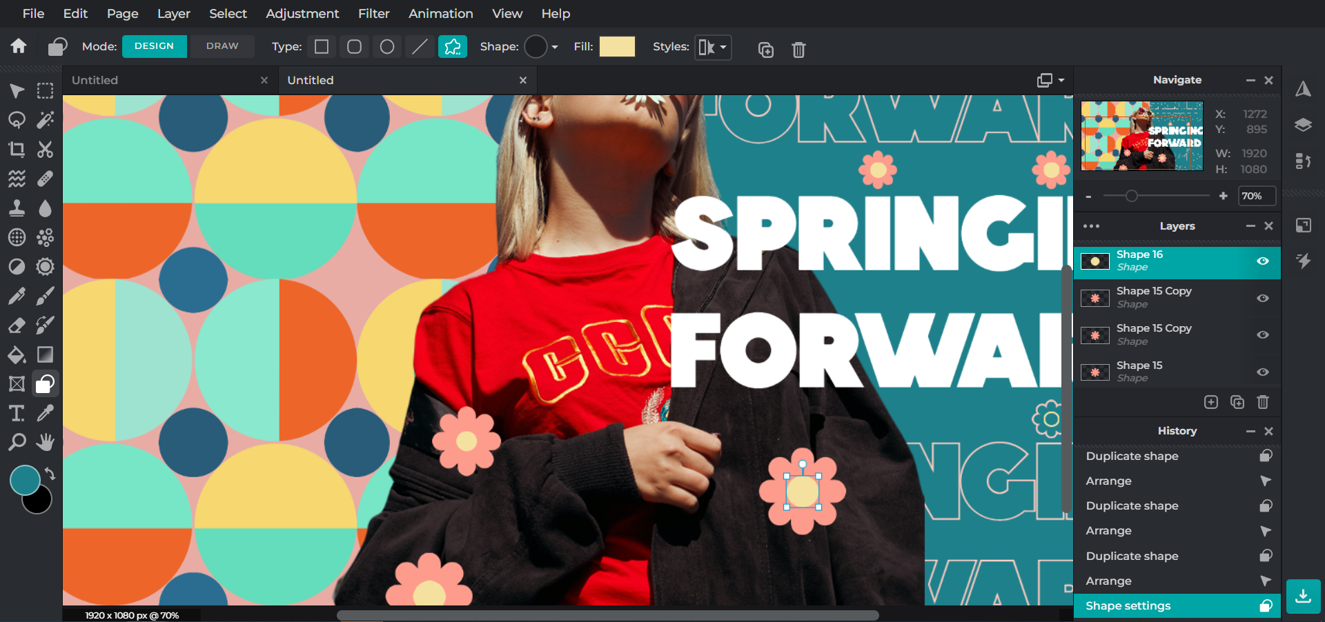
For final touches, we’re adding a few more of the flowers around our design.
And voila – there you have it, your fun, youthful, colorful artwork!
Spring Forward with Pixlr Today!
Now that we’ve shown you all our tricks up our sleeve, you can start creating your own spring-themed design by incorporating all these trends.
Get creative and share your final artwork with us by tagging @pixlr on Facebook and Instagram – we’d love to see what you can create with Pixlr!
