https://vimeo.com/98155673
There’s a sweet spot between art and photography that we often seek out. We love to see people take their phones and tablets and create art out of photographs that might otherwise seem ho-hum or normal. That’s the promise of editing, and some people are quite good at it. In fact, some people can turn casually snapped photos into art that’s worthy of hanging on a wall.
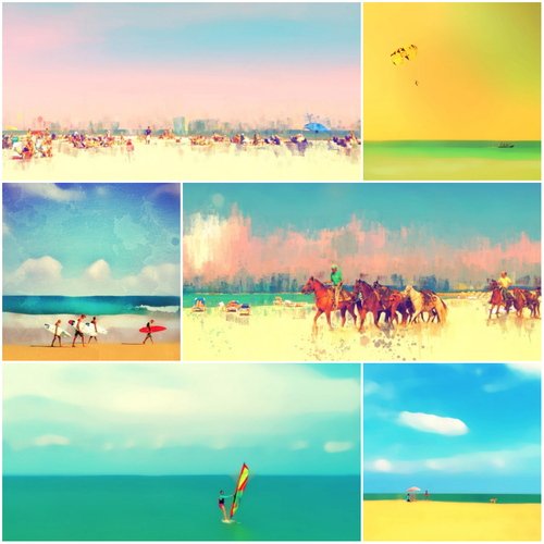
Some people call this iPhoneographic art, but whatever you call it you will probably agree that making beautiful art from a phone you carry in your pocket is completely awesome and shows how great it is to live in this day and age. But can you, yourself, do it? Heck yeah you can. We’re going to show you how to make things like this:

We asked Cindy Patrick, a Philadelphia-based photographer who makes quite stunning art with apps like ours to show us how she does it. She uses lots of different apps but has developed a pretty streamlined process for creating what look like canvas paintings of seaside tableaux. We wanted to capture her process, and we thought the best way to do that would be to simply have her record her workflow so we can break down the process into easy-to-follow steps that Pixlr users can perform to make their own wall-worthy art.
We put together a video for you to watch, and we’ve included the steps here in this post so you can follow along. This is an excellent way to create a portrait of a loved one or a landscape that deserves to be immortalized as a painting — but without having to learn how to draw and paint from scratch.

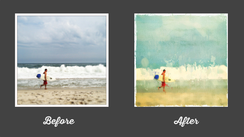
Cindy’s goal with many of her images is to make the original photographic image look more like a painting. She also loves color, so she usually find ways to enhance or alter the existing color of the captured image. Here is her process for this image of a surfer:
Step 1: Basic Editing
She firsts opens her image in Iris Photo Suite and applies the “DynaRange” filter, which brightens the highlights and shadows, and “lifts” the image overall. This is very often the first step in her processing workflow. If you don’t have that app, some basic photo editing in Pixlr Express will get you there. The goal is to balance your lights and darks, and even something as simple as using auto-fix will probably get you there. After applying the filter, she saves the image to her camera roll.
Step 2: Stylize
Next, Cindy opens the image created in Step 1 in Pixlr Express. First, she crops the borders. She generally doesn’t like borders on her images, and she tends to crop them as a rule. But for this image, she knows she wants to add a stylized border later, so she eliminates it at this stage. She saves this cropped version of the image to her camera roll.
While still in Pixlr Express, she applies the “Dapple” filter (Stylize > Dapple). This gives her a nice painterly version of her photo. She saves this version to her camera roll and exits Pixlr.
Step 3: Blending
Next, she opens the Superimpose app and opens the cropped “DynaRange” version of the image (from Step 2) which automatically becomes her background image. She then opens the “Dapple” version as the foreground image (from Step 3) and blends the two images together using the “Darken” blend mode. This gives her a painterly version of the image but with a little bit of the realism brought back in. She backs off on the opacity a bit, and then saves that version to her camera roll.
If you don’t have Superimpose, you can experiment with the add-an-image feature in Pixlr Express and perform a similar task. Or, if you’re happy with how stylized your image is and don’t want to dial it back with realism, you can simply skip this step. It’s up to you to decide how realistic/painterly you want your image to become.
Step 4: Blur
Next, she opens the new version of the image (from Step 4) in the Blur FX app. She sets the blur mode to median blur and turns on the mask feature so she can see her image beneath. She proceeds to erase the blur from the figure of the surfer. After erasing the blur, she continues to refine the edges and clean up the selection. Before saving, she backs off on the blur a bit by moving the slider to the left and bringing some of the original image back in. She saves this image to her camera roll.
If you don’t have Blur FX, try the blur option in Pixlr Express and then erase the parts you don’t want to be blurry using the History Brush. The History Brush is probably one of the most overlooked but most useful tools in Pixlr Express. You can use it to layer on intense effects and then “paint out” the details in your image (like the surfer figure in Cindy’s image).
Step 5: Color, Texture
Next, she opens this new blurred version of the image in Pixlr Express. She knows she wants to adjust the color a bit, so she adds a filter by selecting “Effect” and then “Vintage and “Borg.” This gives her an overall turquoise color that she loves.
Next, she applies a texture by selecting “Overlay,” “Canvas,” and “Sand.” She then selects the History Brush (adjustment > history) and erases the sand texture from the figure of the surfer. Sand is a superb choice of overlay based on her painting, but you might simply want to choose the Canvas overlay if you’re goal is to make it look like a canvas painting. You can control the opacity and dial back the effect if you’re looking for something more subtle. Experiment!
Step 6: Finishing Touches
Next, she selects Borders > Default > Grunge and applies the border of choice to her image. She saves and exits the Pixlr app. Finally, Cindy like to add some drips and drops of paint, which she does in an app called Repix. That’s it. That’s Cindy’s entire process for making art. You can skip some of these steps or do them all exactly like she does, but whatever you do keep experimenting.
Do you make art like this? Please let us know. We’re on the lookout for art like this, and you can reach us on Twitter: @pixlr.
Last Update:
September 15, 2013