5 Summer Color Palettes You Should Use in Your Designs This Season
What better way to kickstart your summer designs than to get inspired with the right color palettes?
If you are on the lookout for stunning color combinations, we have just the right guide for you. Sit back and relax as we quench your thirst for the most captivating summer palettes you have ever seen yet.
Why utilize colors?
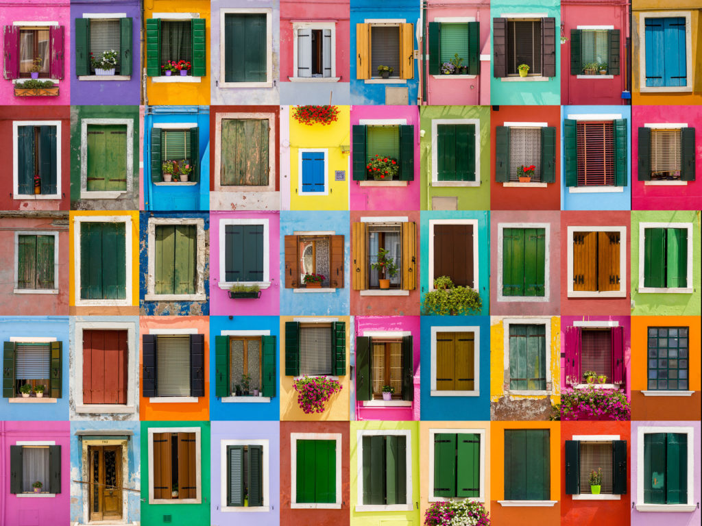
It is a known fact that colors are a powerful tool in designs. Lots of research has proven that each color has its own specific impact on our emotions and well being, and how we perceive them tends to be universal. For instance, Pantone’s colors of this year were said to represent unity, stability and hope. Effectively, by blending the right hues, you would be able to tell a flawless narrative.
Marketers too had long utilized colors to symbolize their core brand values. This further boosts the message that they want to convey to the audience. Hence, if you understand the psychology behind colors, it goes without saying that you can easily alter how your designs can be perceived.
Now, let’s get your creative juices flowing by browsing through these specially curated summer palettes!
1. Fresh, Fun & Flirty
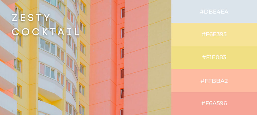
When it comes to summer vibes, one often associates it with refreshing drinks and fruity cocktails. So why not try to incorporate these feelings into the colors you choose for your designs? Give your social media a refreshing new look with cheery and pleasant shades such as above.
With a smidge of pastel peaches, a little splatter of whimsy yellows balanced with a light blueish gray, you would be able to get that saccharine sweet summer look.
However, keep in mind that not every brand can work off pastel shades, as it all depends on the demographics you are targeting. Pastels are often ideal in bringing out the softness of your products, which works well with brands that sell sweet goods, cafes, or baby clothes. Hence, if your brand focuses on emphasizing its products’ sturdiness, security and trust, pastel may not be the most optimal design approach.
2. Wandering Soul
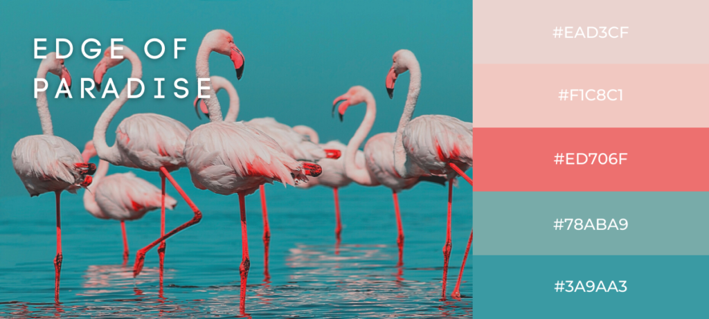
Of course, summer is the most vibrant season there is. When we think of summer, we think of vivid shades of blue. It almost seems that the very essence of summer is blue itself, and for designers, it can be quite restrictive to your color choices. However, don’t let this notion limit your creative freedom!
For instance, the palette above combines this dark cyan and salmon color, balanced with a dash of pastel and muted pinks. Though it may seem unorthodox at a glance, the overall picture still holds a large resemblance to a scenic summer palette.
Hence, if the palette above seems fitting for your target audience, have at it! Don’t be afraid to mix it up and pair shades of blues with other unthinkable colors too – feel free to experiment to your heart’s content.
3. Beach Please
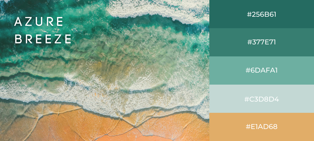
If you would like to capture the fundamentals of summer, stunning beaches would be your go-to inspiration. Dive back into the basics and reimagine it with your own original twists.
As you can see, this eye-catching palette above is derived entirely from a top view of a brilliant beach. By taking different tones of cyan, turquoise and pastel blue, combined with a smidge of beige, your entire palette now serves as a gentle nostalgia of beach trips to your viewers.
For designers, it is imperative to know just exactly what emotions would your color choices evoke in the audience. When it comes to color psychology, blue is generally associated with melancholy, though this is not necessarily applicable to every variance of blue there is. According to research, green and blue shades often give off a calming and relaxing effect. As they are cool colors, they tend to give less strain on the viewers’ eyes, while also proven to lower blood pressure.
4. Under The Tuscan Sun
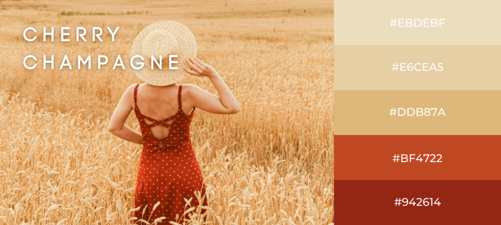
What is summer without delectable fresh fruits and good drinks? As the season itself often comes hand in hand with time off, vacations and chilling, why not approach your color palettes from this angle? Inspired by a summer spent at an Italian countryside, this palette combines a well-loved fruit with a bubbly picnic drink.
Take a look at this palette above for example – the dark cherry reds, the creamy beiges and the greyish white play off each other so incredibly well. To have your inspiration sourced from your favorite summer cocktails would actually add tons of fun into your designing process. This way, your personality can shine through your color choices, letting your audience know that you never stray from your authentic self.
5. Fruity Pops
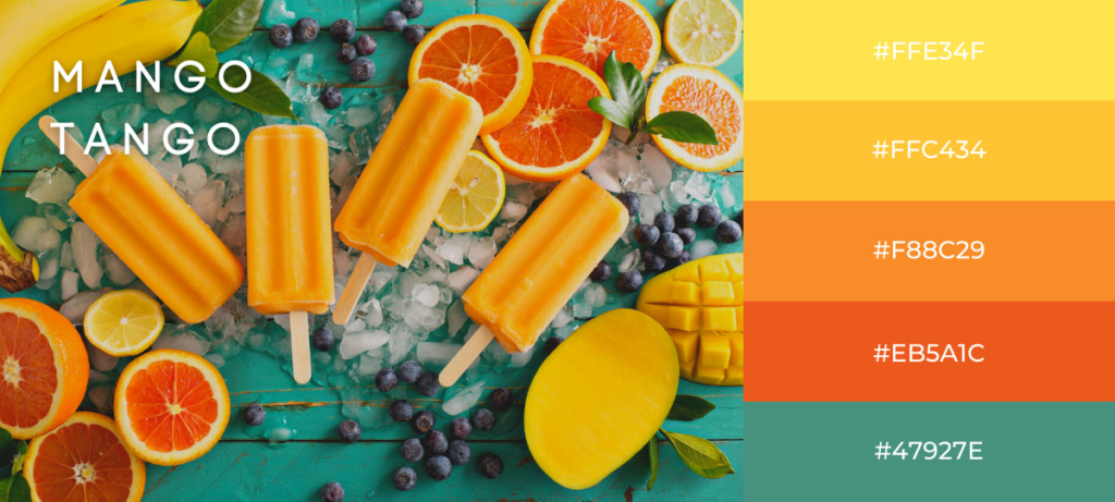
Adding some flavor to your summer color palettes may be the one thing you are missing right now! Think of fresh, tanginess of oranges coupled with honeyed sweet mangos. Add a color that is intermediary related to these warm tones, and voila! Just like that, you’ll have your very own unique summer colors for your upcoming designs.
As orange and yellow fall into the spectrum of warm colors, you can utilize them to depict a sense of warmth and comfort to your demographic. Also, using warm colors tends to convey cheerfulness, positivity and coziness within the audience. With a contrasting cool color such as turquoise would give your overall design a balanced look.
Combining a splash of cool tones with warm ones would balance your overall design. The defined contrasts between the warm and cool colors would broaden the responses you may get from your design, as different people may lean towards different spectrums of the color wheel.
Colors Make A World of Difference
There’s no denying that color is a language of its own. It has been used for ages by artists and designers alike for self-expression, creating narratives and influencing others. Hence, let all your worries fade away and venture deep into color experimentation!
Challenge your artistic versatility and let your imagination soar high. If there’s a slight chance of making someone feel a lot better after looking at the plethora of shades in your works, would that not make it all the more worthwhile?
